UX Design Audit
Bureau Marketing Website
UX Design Audit
Bureau Marketing Website
UX Design Audit
Bureau Marketing Website
Usability Heuristics
Usability Heuristics
Usability Heuristics
UX Audit
UX Audit
UX Audit
Design Audit For

Overview
Overview
Overview
Bureau provides a user-friendly and efficient way to verify customer identities, reducing the risk of fraud and ensuring compliance with regulatory requirements.
The Bureau website serves as the gateway to the comprehensive platform, offering businesses a seamless experience for digital identity verification, fraud prevention, and KYC solutions. It serves as an informative hub where businesses can learn more the technology used, and access resources to support their compliance and security needs.
Role, Team & Duration
Role, Team & Duration
Role, Team & Duration
Product Designer at Bureau
Product Designer at Bureau
Product Designer at Bureau
Worked under Patrick Klima (Product Manager)
Worked under Patrick Klima (Product Manager)
Worked under Patrick Klima (Product Manager)
August 2023
August 2023
August 2023
The Challenge
The Challenge
The Challenge
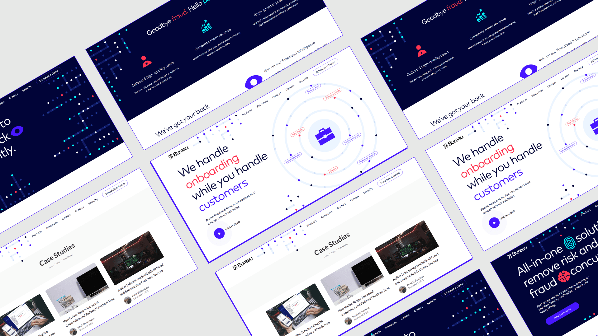
The Bureau Website, despite its modern and clean appearance, faced accessibility challenges for many users. It had broken links, navigation issues, and other significant problems that were hindering lead generation. Therefore, a UX audit was conducted for the website, with a particular focus on usability heuristics.
The Bureau Website, despite its modern and clean appearance, faced accessibility challenges for many users. It had broken links, navigation issues, and other significant problems that were hindering lead generation. Therefore, a UX audit was conducted for the website, with a particular focus on usability heuristics.
The Bureau Website, despite its modern and clean appearance, faced accessibility challenges for many users. It had broken links, navigation issues, and other significant problems that were hindering lead generation. Therefore, a UX audit was conducted for the website, with a particular focus on usability heuristics.
The Process
The Process
The Process
Establishing the groundwork.
Establishing the groundwork.
Establishing the groundwork.
Usability heuristics provide an excellent means to identify inconsistencies or accessibility issues in a design, particularly when a product is about to be redesigned. Addressing errors and usability issues from the previous version can help prevent them in the redesigned one. Since Bureau's website was due for a redesign, this project would provide us with deeper insights into the website's user experience challenges.
Usability heuristics provide an excellent means to identify inconsistencies or accessibility issues in a design, particularly when a product is about to be redesigned. Addressing errors and usability issues from the previous version can help prevent them in the redesigned one. Since Bureau's website was due for a redesign, this project would provide us with deeper insights into the website's user experience challenges.
Usability heuristics provide an excellent means to identify inconsistencies or accessibility issues in a design, particularly when a product is about to be redesigned. Addressing errors and usability issues from the previous version can help prevent them in the redesigned one. Since Bureau's website was due for a redesign, this project would provide us with deeper insights into the website's user experience challenges.
Design Audit - Based on usability heuristics
Design Audit - Based on usability heuristics
Design Audit - Based on usability heuristics
This UX Audit is done for the following 3 areas of the website
This UX Audit is done for the following 3 areas of the website
This UX Audit is done for the following 3 areas of the website

Navigation & Footer
Navigation & Footer
Navigation & Footer
Home Page
Home Page
Home Page
Solutions Page
Solutions Page
Solutions Page
I identified issues with specific areas, and in addition to documenting them, I also indicated which usability heuristic was violated by each section. I also provided my personal recommendations for addressing these issues.
I identified issues with specific areas, and in addition to documenting them, I also indicated which usability heuristic was violated by each section. I also provided my personal recommendations for addressing these issues.
I identified issues with specific areas, and in addition to documenting them, I also indicated which usability heuristic was violated by each section. I also provided my personal recommendations for addressing these issues.
01.
01.
01.
Navigation & Footer.
Navigation & Footer.
Navigation & Footer.
Findings & Recommendations
Findings & Recommendations
Findings & Recommendations
Aa Findings
Aa Findings
Aa Findings
Aa Heuristics violated
Aa Heuristics violated
Aa Heuristics violated
Aa Recommendations
Aa Recommendations
Aa Recommendations
Navigation Bar
Navigation Bar
Navigation Bar

1.1
1.1
1.1
No dropdown indicator.
No dropdown indicator.
No dropdown indicator.
Recognition rather than recall.
Recognition rather than recall.
Recognition rather than recall.
The ‘Products’ section has 3 items in a dropdown, but the chevron icon for dropdown isn't shown beside it. Users might get confused between navbar items that have dropdowns and ones which lead to new pages.
The ‘Products’ section has 3 items in a dropdown, but the chevron icon for dropdown isn't shown beside it. Users might get confused between navbar items that have dropdowns and ones which lead to new pages.
The ‘Products’ section has 3 items in a dropdown, but the chevron icon for dropdown isn't shown beside it. Users might get confused between navbar items that have dropdowns and ones which lead to new pages.
A chevron icon should be present alongside ‘products’ to show it has more options in a dropdown.
A chevron icon should be present alongside ‘products’ to show it has more options in a dropdown.
A chevron icon should be present alongside ‘products’ to show it has more options in a dropdown.
Navigation Bar - on scroll
Navigation Bar - on scroll
Navigation Bar - on scroll

1.2
1.2
No dropdown indicator.
No dropdown indicator.
No dropdown indicator.
Flexibility and efficiency of use.
Flexibility and efficiency of use.
Flexibility and efficiency of use.
Almost all the pages on this website are long, especially the landing page. Thus after scrolling down, if the user finds the need to check out some other pages mentioned on the navbar, they would have to scroll all the way up. All of this leads up to extra effort on the user's side.
Almost all the pages on this website are long, especially the landing page. Thus after scrolling down, if the user finds the need to check out some other pages mentioned on the navbar, they would have to scroll all the way up. All of this leads up to extra effort on the user's side.
Almost all the pages on this website are long, especially the landing page. Thus after scrolling down, if the user finds the need to check out some other pages mentioned on the navbar, they would have to scroll all the way up. All of this leads up to extra effort on the user's side.
The navigation bar can be made sticky, for the users to check out other navbar items whenever needed.
The navigation bar can be made sticky, for the users to check out other navbar items whenever needed.
The navigation bar can be made sticky, for the users to check out other navbar items whenever needed.
1.2
CTA on Hover
CTA on Hover
CTA on Hover

1.3
1.3
Confusing Schedule a Demo CTA.
Confusing Schedule a Demo CTA.
Confusing Schedule a Demo CTA.
Match between system and the real world.
Match between system and the real world.
Match between system and the real world.
The CTA on the navbar that says ‘schedule a demo’ does not actually schedule a demo. It is a contact-us form, that asks for contact details from the user and ‘how can we help’.Instead of giving an option to schedule anything, this journey expects the user to wait for the team to get back.
The CTA on the navbar that says ‘schedule a demo’ does not actually schedule a demo. It is a contact-us form, that asks for contact details from the user and ‘how can we help’.Instead of giving an option to schedule anything, this journey expects the user to wait for the team to get back.
The CTA on the navbar that says ‘schedule a demo’ does not actually schedule a demo. It is a contact-us form, that asks for contact details from the user and ‘how can we help’.Instead of giving an option to schedule anything, this journey expects the user to wait for the team to get back.
Schedule a demo button should actually lead to a page where the user can schedule a meeting with the team, for example setting up a meeting through calendly etc.
Schedule a demo button should actually lead to a page where the user can schedule a meeting with the team, for example setting up a meeting through calendly etc.
Schedule a demo button should actually lead to a page where the user can schedule a meeting with the team, for example setting up a meeting through calendly etc.
1.3
Navigation bar
Navigation bar
Navigation bar

1.4
1.4
Repetition of pages.
Repetition of pages.
Repetition of pages.
Consistency and standards.
Consistency and standards.
Consistency and standards.
The contact-us page is linked from both ‘contact’ and ‘schedule a demo’ button on the navbar which is very confusing for a user.
The contact-us page is linked from both ‘contact’ and ‘schedule a demo’ button on the navbar which is very confusing for a user.
The contact-us page is linked from both ‘contact’ and ‘schedule a demo’ button on the navbar which is very confusing for a user.
Schedule a demo should be removed completely, or an automated meeting scheduling page should be linked to the button.
Schedule a demo should be removed completely, or an automated meeting scheduling page should be linked to the button.
Schedule a demo should be removed completely, or an automated meeting scheduling page should be linked to the button.
1.4
Navigation bar
Navigation bar
Navigation bar

Solutions page
Solutions page
Solutions page

1.5
1.5
Confusing Design Element.
Confusing Design Element.
Confusing Design Element.
Consistency and standards.
Consistency and standards.
Consistency and standards.
Some of the design elements act as false signifiers which actually do not have the affordance of clicking. This is due to their similarity with the action button. The design elements that are used just below the navbar CTA to show different user states like ‘verified’, or ‘fake user IDs’, have the same design as the button above it. It might lead to confusion as to whether it’s clickable or actionable.
Some of the design elements act as false signifiers which actually do not have the affordance of clicking. This is due to their similarity with the action button. The design elements that are used just below the navbar CTA to show different user states like ‘verified’, or ‘fake user IDs’, have the same design as the button above it. It might lead to confusion as to whether it’s clickable or actionable.
Some of the design elements act as false signifiers which actually do not have the affordance of clicking. This is due to their similarity with the action button. The design elements that are used just below the navbar CTA to show different user states like ‘verified’, or ‘fake user IDs’, have the same design as the button above it. It might lead to confusion as to whether it’s clickable or actionable.
‘Schedule a demo’, being the primary action button should have a filled style like other buttons in the page.
‘Schedule a demo’, being the primary action button should have a filled style like other buttons in the page.
‘Schedule a demo’, being the primary action button should have a filled style like other buttons in the page.
1.4
1.6
1.6
Resources are actually blogs.
Resources are actually blogs.
Resources are actually blogs.
Match between system and the real world.
Match between system and the real world.
Match between system and the real world.
The term ‘resources’, especially in the tech world inclines more toward documentation about how to use the product, or components, resources that’ll help users in using the product better rather than articles or blogs.
The term ‘resources’, especially in the tech world inclines more toward documentation about how to use the product, or components, resources that’ll help users in using the product better rather than articles or blogs.
The term ‘resources’, especially in the tech world inclines more toward documentation about how to use the product, or components, resources that’ll help users in using the product better rather than articles or blogs.
Thus, the page on the navigation bar mentioned as resources should be changed to articles or blogs.
Thus, the page on the navigation bar mentioned as resources should be changed to articles or blogs.
Thus, the page on the navigation bar mentioned as resources should be changed to articles or blogs.
1.4
1.7
1.7
Inconsistency in page names.
Inconsistency in page names.
Inconsistency in page names.
Consistency and standards.
Consistency and standards.
Consistency and standards.
The page which is named ‘use cases’ under ‘products’ in the navbar is added in the footer as solutions. It appears as ‘solutions’ in the address bar of the browser as well. This inconsistency in naming a page will end up leaving the users confused.
The page which is named ‘use cases’ under ‘products’ in the navbar is added in the footer as solutions. It appears as ‘solutions’ in the address bar of the browser as well. This inconsistency in naming a page will end up leaving the users confused.
The page which is named ‘use cases’ under ‘products’ in the navbar is added in the footer as solutions. It appears as ‘solutions’ in the address bar of the browser as well. This inconsistency in naming a page will end up leaving the users confused.
The page should be named either solutions, or use cases, but consistently across all places.
The page should be named either solutions, or use cases, but consistently across all places.
The page should be named either solutions, or use cases, but consistently across all places.
1.4
Footer
Footer
Footer

Navigation bar
Navigation bar
Navigation bar

1.8
1.8
Layout inconsistency in the footer.
Layout inconsistency in the footer.
Layout inconsistency in the footer.
Consistency and standards.
Consistency and standards.
Consistency and standards.
Two of the dropdown items under ‘products’ in the navbar, i.e, ‘RTO Protection’ & ‘Decisioning Platform’ are not mentioned in the footer at all, but ‘use cases’ is mentioned as ‘solutions’.
Two of the dropdown items under ‘products’ in the navbar, i.e, ‘RTO Protection’ & ‘Decisioning Platform’ are not mentioned in the footer at all, but ‘use cases’ is mentioned as ‘solutions’.
Two of the dropdown items under ‘products’ in the navbar, i.e, ‘RTO Protection’ & ‘Decisioning Platform’ are not mentioned in the footer at all, but ‘use cases’ is mentioned as ‘solutions’.
The footer includes all the links that exist in the navigation menu, so to maintain consistency, these three pages should also be grouped together and added to the footer.
The footer includes all the links that exist in the navigation menu, so to maintain consistency, these three pages should also be grouped together and added to the footer.
The footer includes all the links that exist in the navigation menu, so to maintain consistency, these three pages should also be grouped together and added to the footer.
1.4
02.
02.
02.
Home Page.
Findings & Recommendations
Findings & Recommendations
Findings & Recommendations
Aa Findings
Aa Findings
Aa Findings
Aa Heuristics violated
Aa Heuristics violated
Aa Heuristics violated
Aa Recommendations
Aa Recommendations
Aa Recommendations
HERO SECTION
HERO SECTION
HERO SECTION

2.1
2.1
2.1
Hero section title & text.
Hero section title & text.
Hero section title & text.
Consistency and standards.
Consistency and standards.
Consistency and standards.
The title of the hero section does not help the user understand what the product is, but rather jumps on what it can do. The idea, though appreciable, leads to confusion for first-time visitors of the website, or platforms of a similar category.
The title of the hero section does not help the user understand what the product is, but rather jumps on what it can do. The idea, though appreciable, leads to confusion for first-time visitors of the website, or platforms of a similar category.
The title of the hero section does not help the user understand what the product is, but rather jumps on what it can do. The idea, though appreciable, leads to confusion for first-time visitors of the website, or platforms of a similar category.
The descriptive text could contain information about the nature of the product, whether it’s a Saas-based platform or some other kind of tool which gives the user an idea about the product. It can also include details about how exactly can businesses use this product easily to solve their problems.
The descriptive text could contain information about the nature of the product, whether it’s a Saas-based platform or some other kind of tool which gives the user an idea about the product. It can also include details about how exactly can businesses use this product easily to solve their problems.
The descriptive text could contain information about the nature of the product, whether it’s a Saas-based platform or some other kind of tool which gives the user an idea about the product. It can also include details about how exactly can businesses use this product easily to solve their problems.
2.2
2.2
2.2
Graphic is not easily understandable.
Graphic is not easily understandable.
Graphic is not easily understandable.
Aesthetic and minimalist design.
Aesthetic and minimalist design.
Aesthetic and minimalist design.
The main graphic used in the hero section does not give a lot of context to the title beside it or doesn’t explain the companies working procedure clearly.
The main graphic used in the hero section does not give a lot of context to the title beside it or doesn’t explain the companies working procedure clearly.
The main graphic used in the hero section does not give a lot of context to the title beside it or doesn’t explain the companies working procedure clearly.
It could’ve been animated to show the actions taking place right on the user’s screen.
It could’ve been animated to show the actions taking place right on the user’s screen.
It could’ve been animated to show the actions taking place right on the user’s screen.
Section 2
Section 2
Section 2

2.3
2.3
Text block has no context.
Text block has no context.
Text block has no context.
Consistency and standards.
Consistency and standards.
Consistency and standards.
This text, even though adding meaning to the entire product description, looks disconnected. It exists without a proper title or any context. There’s a lot of space between its previous and next sections. It also has an inconsistent kerning of -1.1 which doesn’t exist in the case of other body texts. This particular font size is also not used anywhere in the entire for either body or the title.
This text, even though adding meaning to the entire product description, looks disconnected. It exists without a proper title or any context. There’s a lot of space between its previous and next sections. It also has an inconsistent kerning of -1.1 which doesn’t exist in the case of other body texts. This particular font size is also not used anywhere in the entire for either body or the title.
This text, even though adding meaning to the entire product description, looks disconnected. It exists without a proper title or any context. There’s a lot of space between its previous and next sections. It also has an inconsistent kerning of -1.1 which doesn’t exist in the case of other body texts. This particular font size is also not used anywhere in the entire for either body or the title.
This text can either be removed, added in the description of the hero section, or used as the title for the next section.
This text can either be removed, added in the description of the hero section, or used as the title for the next section.
This text can either be removed, added in the description of the hero section, or used as the title for the next section.
2.3
2.4
2.4
No proper distinction between sections.
No proper distinction between sections.
No proper distinction between sections.
Aesthetic and minimalist design.
Aesthetic and minimalist design.
Aesthetic and minimalist design.
The overall design and layouting of this section look very distinguished from the line of text above. However, there is no definitive distinction between both the sections which creates a visual confusion.
The overall design and layouting of this section look very distinguished from the line of text above. However, there is no definitive distinction between both the sections which creates a visual confusion.
The overall design and layouting of this section look very distinguished from the line of text above. However, there is no definitive distinction between both the sections which creates a visual confusion.
In this case, there should've been a separation of sections through background colors, spacing, or any other methods to make the distinction clearer for the user. Providing the data in smaller chunks to the user is beneficial for them as it results in a better understanding.
In this case, there should've been a separation of sections through background colors, spacing, or any other methods to make the distinction clearer for the user. Providing the data in smaller chunks to the user is beneficial for them as it results in a better understanding.
In this case, there should've been a separation of sections through background colors, spacing, or any other methods to make the distinction clearer for the user. Providing the data in smaller chunks to the user is beneficial for them as it results in a better understanding.
2.4
Section 3
Section 3
Section 3

2.5
2.5
Design inconsistency in icon color.
Design inconsistency in icon color.
Design inconsistency in icon color.
Consistency and standards.
Consistency and standards.
Consistency and standards.
For the earlier sections with a white background color, the main shades used for illustrations were light blue, blue, and red. But for this section, and only in this case has dark blue been used for an illustration. It adds to the inconsistency in the design system.
For the earlier sections with a white background color, the main shades used for illustrations were light blue, blue, and red. But for this section, and only in this case has dark blue been used for an illustration. It adds to the inconsistency in the design system.
For the earlier sections with a white background color, the main shades used for illustrations were light blue, blue, and red. But for this section, and only in this case has dark blue been used for an illustration. It adds to the inconsistency in the design system.
A set color combination can be chosen for the illustrations that work best on both light & dark backgrounds to maintain consistency.
A set color combination can be chosen for the illustrations that work best on both light & dark backgrounds to maintain consistency.
A set color combination can be chosen for the illustrations that work best on both light & dark backgrounds to maintain consistency.
2.5
2.6
2.6
Visual clutter due to pattern.
Visual clutter due to pattern.
Visual clutter due to pattern.
Aesthetic and minimalist design.
Aesthetic and minimalist design.
Aesthetic and minimalist design.
The dot patterns have similar high contrast colors involved as the illustrations beside them and are a great lot in number. Thus, they end up catching more attention from the users and distracting them from what actually matters.
The dot patterns have similar high contrast colors involved as the illustrations beside them and are a great lot in number. Thus, they end up catching more attention from the users and distracting them from what actually matters.
The dot patterns have similar high contrast colors involved as the illustrations beside them and are a great lot in number. Thus, they end up catching more attention from the users and distracting them from what actually matters.
The pattern can be made more subtle by reducing its opacity (contrast with the bg), or by reducing its size and intensity.
The pattern can be made more subtle by reducing its opacity (contrast with the bg), or by reducing its size and intensity.
The pattern can be made more subtle by reducing its opacity (contrast with the bg), or by reducing its size and intensity.
2.6
Clients list
Clients list
Clients list

2.7
2.7
Animation is too fast.
Animation is too fast.
Animation is too fast.
Flexibility and efficiency of use.
Flexibility and efficiency of use.
Flexibility and efficiency of use.
The automated carousel listing past clients is too fast to properly see & register the names or branding of each company. Even though the carousel stops on hover, we cannot expect the users to take this action every time they want to read the company’s name.
The automated carousel listing past clients is too fast to properly see & register the names or branding of each company. Even though the carousel stops on hover, we cannot expect the users to take this action every time they want to read the company’s name.
The automated carousel listing past clients is too fast to properly see & register the names or branding of each company. Even though the carousel stops on hover, we cannot expect the users to take this action every time they want to read the company’s name.
Thus, it’s speed can be slowed down a bit.
Thus, it’s speed can be slowed down a bit.
Thus, it’s speed can be slowed down a bit.
2.7
testimonials
testimonials
testimonials

Case studies & blogs
Case studies & blogs
Case studies & blogs

2.8
2.8
Design system inconsistency.
Design system inconsistency.
Design system inconsistency.
Consistency and standards.
Consistency and standards.
Consistency and standards.
There is no use of this particular shade of peach in the entire website except in this section. Using it only here makes it look disconnected even though it goes with the aesthetic and gives contrast to the color combination.
There is no use of this particular shade of peach in the entire website except in this section. Using it only here makes it look disconnected even though it goes with the aesthetic and gives contrast to the color combination.
There is no use of this particular shade of peach in the entire website except in this section. Using it only here makes it look disconnected even though it goes with the aesthetic and gives contrast to the color combination.
This shade of peach could be used more in the entire design system.
This shade of peach could be used more in the entire design system.
This shade of peach could be used more in the entire design system.
2.8
2.9
2.9
Confusing navigation through breadcrumbs.
Confusing navigation through breadcrumbs.
Confusing navigation through breadcrumbs.
User control and freedom.
User control and freedom.
User control and freedom.
On clicking the ‘Read Case Studies’ button, the user is redirected to a ‘Case Studies’ page listing all the case studies. It also has a breadcrumb navigation on top with an option to go back to home, or blogs. After clicking on blogs, the user ends up on the ‘All Posts’, i.e, blogs page from where they can no more navigate back to case studies.
On clicking the ‘Read Case Studies’ button, the user is redirected to a ‘Case Studies’ page listing all the case studies. It also has a breadcrumb navigation on top with an option to go back to home, or blogs. After clicking on blogs, the user ends up on the ‘All Posts’, i.e, blogs page from where they can no more navigate back to case studies.
On clicking the ‘Read Case Studies’ button, the user is redirected to a ‘Case Studies’ page listing all the case studies. It also has a breadcrumb navigation on top with an option to go back to home, or blogs. After clicking on blogs, the user ends up on the ‘All Posts’, i.e, blogs page from where they can no more navigate back to case studies.
This issue can be prevented by sorting the information architecture of this entire ‘blog’ or ‘article’ section, due to many inconsistencies present throughout multiple pages.
This issue can be prevented by sorting the information architecture of this entire ‘blog’ or ‘article’ section, due to many inconsistencies present throughout multiple pages.
This issue can be prevented by sorting the information architecture of this entire ‘blog’ or ‘article’ section, due to many inconsistencies present throughout multiple pages.
2.9
Features section
Features section
Features section

2.10
2.10
Visually distracting element.
Visually distracting element.
Visually distracting element.
Aesthetic and minimalist design.
Aesthetic and minimalist design.
Aesthetic and minimalist design.
This icon on top seems irrelevant due to its very large size and no special meaning being added to the section through it. It ends up getting the maximum attention due to its size and color.
This icon on top seems irrelevant due to its very large size and no special meaning being added to the section through it. It ends up getting the maximum attention due to its size and color.
This icon on top seems irrelevant due to its very large size and no special meaning being added to the section through it. It ends up getting the maximum attention due to its size and color.
Each descriptive point could have individual illustrations or icons to direct the user’s attention toward content that matters.
Each descriptive point could have individual illustrations or icons to direct the user’s attention toward content that matters.
Each descriptive point could have individual illustrations or icons to direct the user’s attention toward content that matters.
2.10
CTA Section
CTA Section
CTA Section

2.11
2.11
Visual clutter on the entire section.
Visual clutter on the entire section.
Visual clutter on the entire section.
Aesthetic and minimalist design.
Aesthetic and minimalist design.
Aesthetic and minimalist design.
The main CTA button in this section gets lost due to the visual clutter created by the dot pattern. The attention of the user will not be focused on clicking the CTA, but rather on looking at the pattern around it.
The main CTA button in this section gets lost due to the visual clutter created by the dot pattern. The attention of the user will not be focused on clicking the CTA, but rather on looking at the pattern around it.
The main CTA button in this section gets lost due to the visual clutter created by the dot pattern. The attention of the user will not be focused on clicking the CTA, but rather on looking at the pattern around it.
The pattern can be reduced and importance can be given to the Call-to-action by increasing breathing space around it.
The pattern can be reduced and importance can be given to the Call-to-action by increasing breathing space around it.
The pattern can be reduced and importance can be given to the Call-to-action by increasing breathing space around it.
2.11
pre - footer
pre - footer
pre - footer

2.12
2.12
Padding issues between company logo and title.
Padding issues between company logo and title.
Padding issues between company logo and title.
Consistency and standards.
Consistency and standards.
Consistency and standards.
The spacing is inconsistent in this section, which leads to confusion while viewing it. The font size and kerning are also irregular for the two titles here, which creates hierarchical doubts in the minds of users.
The spacing is inconsistent in this section, which leads to confusion while viewing it. The font size and kerning are also irregular for the two titles here, which creates hierarchical doubts in the minds of users.
The spacing is inconsistent in this section, which leads to confusion while viewing it. The font size and kerning are also irregular for the two titles here, which creates hierarchical doubts in the minds of users.
The spacing between ‘Backed by’ & ‘Accreditations’ should be more than the spacing between individual title and body. The font size and kerning should be consistent.
The spacing between ‘Backed by’ & ‘Accreditations’ should be more than the spacing between individual title and body. The font size and kerning should be consistent.
The spacing between ‘Backed by’ & ‘Accreditations’ should be more than the spacing between individual title and body. The font size and kerning should be consistent.
2.12
03.
03.
03.
Solutions Page.
Solutions Page.
Solutions Page.
Findings & Recommendations
Findings & Recommendations
Findings & Recommendations
Aa Findings
Aa Findings
Aa Findings
Aa Heuristics violated
Aa Heuristics violated
Aa Heuristics violated
Aa Recommendations
Aa Recommendations
Aa Recommendations
Hero Section
Hero Section
Hero Section

3.1
3.1
3.1
Hierarchical & layouting issues in the hero section.
Hierarchical & layouting issues in the hero section.
Hierarchical & layouting issues in the hero section.
Consistency and standards.
Consistency and standards.
Consistency and standards.
There is very little breathing space on top of the title, making it appear too close to the navigation menu. Along with that, all the content in the area is written in the same white color, which creates issues in the visual hierarchy of the text. The wide white strip on the bottom has no purpose, and thus gives a feeling of incompletion. These issues prevent the user from focussing on the first most important part, i.e the title.
There is very little breathing space on top of the title, making it appear too close to the navigation menu. Along with that, all the content in the area is written in the same white color, which creates issues in the visual hierarchy of the text. The wide white strip on the bottom has no purpose, and thus gives a feeling of incompletion. These issues prevent the user from focussing on the first most important part, i.e the title.
There is very little breathing space on top of the title, making it appear too close to the navigation menu. Along with that, all the content in the area is written in the same white color, which creates issues in the visual hierarchy of the text. The wide white strip on the bottom has no purpose, and thus gives a feeling of incompletion. These issues prevent the user from focussing on the first most important part, i.e the title.
As a solution, the title can be shifted down, adding some breathing space to the section. Shades of light gray can be used for less important text, like the description to create a proper visual hierarchy.
As a solution, the title can be shifted down, adding some breathing space to the section. Shades of light gray can be used for less important text, like the description to create a proper visual hierarchy.
As a solution, the title can be shifted down, adding some breathing space to the section. Shades of light gray can be used for less important text, like the description to create a proper visual hierarchy.
3.2
3.2
Title has confusing graphics.
Title has confusing graphics.
Title has confusing graphics.
Aesthetic and minimalist design.
Aesthetic and minimalist design.
Aesthetic and minimalist design.
Is there some meaning behind the graphics added in between text in this section? Do they mean ‘AI’, ‘Identity’, and ‘network’? If yes, we cannot assume that everyone would be able to guess the correct word for each.
If the graphics do not mean anything specific, adding them between words in the main title of the page doesn't add any value, but makes reading the statement more frustrating for users.
If the graphics have some specific word-to-word meaning, there should be a way for users to check each of them. If not, it should be removed completely or one graphic that is inclusive of all three ideas should be added to compliment the title.
If the graphics have some specific word-to-word meaning, there should be a way for users to check each of them. If not, it should be removed completely or one graphic that is inclusive of all three ideas should be added to compliment the title.
If the graphics have some specific word-to-word meaning, there should be a way for users to check each of them. If not, it should be removed completely or one graphic that is inclusive of all three ideas should be added to compliment the title.
3.2
section 2
section 2
section 2

section 3
section 3
section 3

section 4
section 4
section 4

3.3
3.3
Inconsistency in text font.
Inconsistency in text font.
Inconsistency in text font.
Consistency and standards.
Consistency and standards.
Consistency and standards.
Font style, size, and kerning inconsistency are present throughout these sections. In some places, ‘Lato’ is used for both subtitles & text, and in others, ‘Mark Pro’ & ‘Lexend’ are used for them respectively.
Font style, size, and kerning inconsistency are present throughout these sections. In some places, ‘Lato’ is used for both subtitles & text, and in others, ‘Mark Pro’ & ‘Lexend’ are used for them respectively.
Font styles including size, type, and kerning should be fixed for titles, subtitles & body, and used consistently throughout the website.
Font styles including size, type, and kerning should be fixed for titles, subtitles & body, and used consistently throughout the website.
Font styles including size, type, and kerning should be fixed for titles, subtitles & body, and used consistently throughout the website.
3.3
3.4
3.4
Contrast issue with this color.
Contrast issue with this color.
Contrast issue with this color.
Consistency and standards.
Consistency and standards.
Consistency and standards.
The color with hex #4AD8C4 has a contrast ratio of 1.76:1 with white background, which fails the contrast check for graphics.
The color with hex #4AD8C4 has a contrast ratio of 1.76:1 with white background, which fails the contrast check for graphics.
A similar color with a higher contrast ratio can be set instead of this shade.
A similar color with a higher contrast ratio can be set instead of this shade.
A similar color with a higher contrast ratio can be set instead of this shade.
3.4
key takeaways & learnings
key takeaways & learnings
key takeaways & learnings
After completing this usability testing project, our team gained better insights into the common design issues. These primarily included:
After completing this usability testing project, our team gained better insights into the common design issues. These primarily included:
After completing this usability testing project, our team gained better insights into the common design issues. These primarily included:
Lack of color consistency
Lack of color consistency
Lack of color consistency
Visual clutter
Visual clutter
Visual clutter
Content inconsistencies
Content inconsistencies
Content inconsistencies
Complex design that is not easy to understand
Complex design that is not easy to understand
Complex design that is not easy to understand
This project helped us prioritize the mentioned areas during the website redesign. Our next steps included creating mood boards for a new design system that aligns with our current brand guidelines but offers improved diversity. We placed particular emphasis on expanding our color palette in the design system. Additionally, we planned to conduct a thorough competitor analysis before starting the redesign project to enhance our marketing strategy.
Personally, I gained significant knowledge from this project. Early on, I delved into an in-depth study of usability heuristics, which was an invaluable learning experience. Following these guidelines can be one of the most straightforward ways to ensure that designs are free of usability issues. Later in the project, I conducted a small-scale review of business and user objectives, along with the website's compliance with UX standards. This provided me with a better understanding of what is currently in demand by both the market and users, in contrast to the experience we currently offer.
Learning about the broader market needs in the industry was not only beneficial for the website but also for other experience design projects I worked on for Bureau.
Thank You For Reading
Thank You For Reading
Thank You For Reading

© 2025 | Designed and developed by me with ♡ | All Rights Reserved.
© 2025 | Designed and developed by me with ♡ | All Rights Reserved.
© 2025 | Designed and developed by me with ♡ | All Rights Reserved.